 Algolia
Accordion
Introduction
Using the default <Collapse> behavior to create an accordion. The collapse is used to show and hide content. With a few classes, buttons or anchors are used as triggers that are mapped to specific toggle elements.
The accordion component is created by extending the default collapse behavior. It's used to toggle the visibility of content.
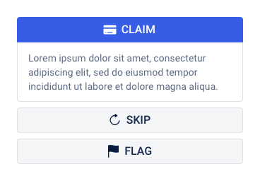
Using accordion to display the content of Claim, Skip and Flag actions in bidding screens, or display the frequently asked questions (FAQs).
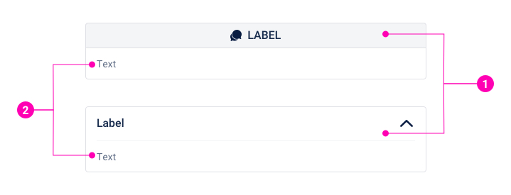
- Toggle Header - Used as triggers that mapped to specific toggle elements.
- Card Body - The content inside the card body is flexible.
Examples
Custom Toggle Header
Often used to the frequently asked questions to display a question in toggle header and an answer in the card body.
Button Toggle Header
Using similar design as a button, this example used to displays the content and shows more information about actions.
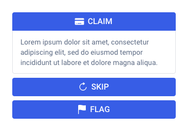
Primary
Secondary
White outline
Collapse
Design Reference
Two or more primary accordion components should not be placed next to each other. Different than a primary accordion component, two or more secondary accordion components can be used in one layout.
API
Accordion
import { Accordion } from '@ahaui/react'Copy import code for the Accordion component| Name | Type | Default | Description |
|---|---|---|---|
| activeKey | string | controlled by: onSelect, initial prop: defaultActivekeyThe current active key that corresponds to the currently expanded card |
Accordion.Toggle
import { Accordion } from '@ahaui/react'Copy import code for the Accordion component| Name | Type | Default | Description |
|---|---|---|---|
| eventKey required | string | A key that corresponds to the collapse component that gets triggered when this has been clicked. | |
| onClick | function | A callback function for when this component is clicked | |
| children required | element | Children prop should only contain a single child, and is enforced as such |
Accordion.Collapse
import { Accordion } from '@ahaui/react'Copy import code for the Accordion component| Name | Type | Default | Description |
|---|---|---|---|
| eventKey required | string | A key that corresponds to the toggler that triggers this collapse's expand or collapse. | |
| children required | element | Children prop should only contain a single child, and is enforced as such |
Collapse
import { Collapse } from '@ahaui/react'Copy import code for the Collapse component| Name | Type | Default | Description |
|---|---|---|---|
| timeout | number | 300 | Duration of the collapse animation in milliseconds, to ensure that finishing callbacks are fired even if the original browser transition end events are canceled |
| dimension | 'height' | 'width' | function | 'height' | The dimension used when collapsing, or a function that returns the dimension Note: Bootstrap only partially supports 'width'!
You will need to supply your own CSS animation for the |
| getDimensionValue | function | element.offsetWidth | element.offsetHeight | Function that returns the height or width of the animating DOM node Allows for providing some custom logic for how much the Collapse component should animate in its specified dimension. Called with the current dimension prop value and the DOM node. |
useAccordionToggle
import { useAccordionToggle } from '@ahaui/react';

const decoratedOnClick = useAccordionToggle(eventKey, onClick);