 Algolia
Bubble Chat
Introduction
The component is used to represent the real-time and archived messages of three main objects: users, experts and system.
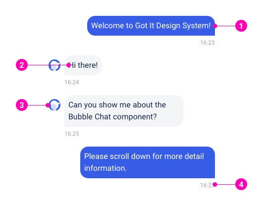
- Message background
- Message content
- Avatar
- Time stamp
Examples
Text Message
File Message
Image Message
Typing Message
Outbound Message
Normally this style is applied for users. Outbound messages use the system’s primary color and right-aligned.
Inbound Message
Normally this style is applied for experts. Inbound messages use the system’s secondary color, left-aligned and have an avatar on the left.
System Message
System messages use the system’s primary-light color, left-aligned and have products’ avatars on the left.
Variants
Light
Primary
PrimaryLight
Dark
TransparentDark
TransparentLight
Design Reference
N/A
API
BubbleChat
import { BubbleChat } from '@ahaui/react'Copy import code for the BubbleChat component| Name | Type | Default | Description |
|---|---|---|---|
| isTyping | boolean | false | The typing message |
| text | any | The text message | |
| type | 'inbound' | 'outbound' | 'system' | 'inbound' | The BubbleChat visual type |
| variant | 'light' | 'primary' | 'primaryLight' | 'dark' | 'transparentDark' | 'transparentLight' | The BubbleChat visual style | |
| avatar | string | function | The avatar to display. The name can get from Component | |
| time | any | The time of a text message | |
| options | arrayOf | The list option using with type | |
| currentOption | string | number | Defines the current active option | |
| onSelectOption | function | Callback fired when the current active option changes. | |
| disabledOption | boolean | Disables the list of options | |
| onClickText | function | Callback fired when click to the text content | |
| textClassName | string | arrayOf | ||
| actionBar | any | Render actionBar after text content | |
| actionBarClassName | string | arrayOf |