A button is a clickable item used to execute an action either in the background or foreground.
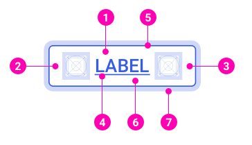
- Button text
- Left icon
- Right icon
- Text underline - The underline is used for button link hover state.
- Border
- Background
- Focus border
Primary
Most of the time, a primary button is used when the consequent action is the main action of a layout.
<Button variant="primary">
<Button.Label>Button</Button.Label>
</Button>
Secondary
Secondary buttons are used to indicate supplementary actions
<Button variant="secondary">
<Button.Label>Button</Button.Label>
</Button>
Primary Outline
A primary outline button is used when the consequent action is considered less important than the primary button but more important than the secondary button.
<Button variant="primary_outline">
<Button.Label>Button</Button.Label>
</Button>
Accent
On some specific layouts (i.e. ask flow or payment), accent buttons overrule the primary buttons to indicate the most important actions.
<Button variant="accent">
<Button.Label>Button</Button.Label>
</Button>
Positive
Positive buttons are used for positive actions (i.e. when users finish a flow). They can be used to update the positive status of an action in view-only mode.
<Button variant="positive">
<Button.Label>Button</Button.Label>
</Button>
Negative
Negative buttons are used for negative actions (i.e. when users quit or stop an important flow).
<Button variant="negative">
<Button.Label>Button</Button.Label>
</Button>
White
Using it as a primary button in color or dark background.
<Button variant="white">
<Button.Label>Button</Button.Label>
</Button>
White Ouline
Using it as a secondary button in color or dark background.
<Button variant="white_outline">
<Button.Label>Button</Button.Label>
</Button>
Link
The button link is the least prominent button. It's often standing next to other buttons to indicate a less important action.
Having paddings, a button link is different, and also, represents a more important action than a text link.
<Button as={SafeAnchor} href="https://designsystem.got-it.io/" variant="link">
<Button.Label>Button</Button.Label>
</Button>
Disabled
Disabled buttons allow users to know the consequent actions but prevent them from executing these actions.
<Button disabled>
<Button.Label>Button</Button.Label>
</Button>
Sizes
Similar to input forms, buttons have three sizes: Small (28px), Medium (default - 36px) and Large (48px).
<>
<div className="u-marginBottomSmall">
<Button size="small">
<Button.Label>Button</Button.Label>
</Button>
</div>
<div className="u-marginBottomSmall">
<Button>
<Button.Label>Button</Button.Label>
</Button>
</div>
<div className="u-marginBottomSmall">
<Button size="large">
<Button.Label>Button</Button.Label>
</Button>
</div>
</>
Default
Flexible with the label inside the button.
<>
<div className="u-marginBottomSmall">
<Button>
<Button.Label>Button</Button.Label>
</Button>
</div>
<div className="u-marginBottomSmall">
<Button>
<Button.Label>Button with long text </Button.Label>
</Button>
</div>
</>
Min width
The minimum width is 112px.
<Button width="min">
<Button.Label>Ok</Button.Label>
</Button>
Full width
When a button’s width is set 100%, the button fully expands to the full width of its parent container.
<Button width="full">
<Button.Label>Button</Button.Label>
</Button>
Text & icon
A button that contains a label and an icon on the left or right of the label.
<Button>
<Button.Icon><Icon name="refresh"/></Button.Icon>
<Button.Label>Refresh</Button.Label>
</Button>
Orther Brand
Microsoft
<Button variant="secondary" className="u-backgroundWhite hover:u-backgroundWhite u-textTransformNone u-roundedNone">
<Button.Icon className="u-lineHeightNone u-marginRightExtraSmall">
<svg height="24" viewBox="0 0 24 24" width="24" xmlns="http://www.w3.org/2000/svg">
<g fill="none">
<path d="m4 4h7.578947v7.578947h-7.578947z" fill="#f25022" />
<path d="m4 12.421053h7.578947v7.578947h-7.578947z" fill="#00a4ef" />
<path d="m12.421053 4h7.578947v7.578947h-7.578947z" fill="#7fba00" />
<path d="m12.421053 12.421053h7.578947v7.578947h-7.578947z" fill="#ffb900" />
</g>
</svg>
</Button.Icon>
<Button.Label>Sign in with Microsoft</Button.Label>
</Button>
Google
<Button variant="secondary" className="u-backgroundWhite hover:u-backgroundWhite u-textTransformNone u-roundedSmall">
<Button.Icon className="u-lineHeightNone u-marginRightExtraSmall">
<svg height="24" viewBox="0 0 24 24" width="24" xmlns="http://www.w3.org/2000/svg">
<g fill="none" fillRule="evenodd" transform="translate(3 3)">
<g fillRule="nonzero">
<path d="m17.64 9.20454545c0-.63818181-.0572727-1.25181818-.1636364-1.84090909h-8.4763636v3.48136364h4.8436364c-.2086364 1.125-.8427273 2.0781818-1.7959091 2.7163636v2.2581819h2.9086363c1.7018182-1.5668182 2.6836364-3.874091 2.6836364-6.61500005z" fill="#4285f4" />
<path d="m9 18c2.43 0 4.4672727-.8059091 5.9563636-2.1804545l-2.9086363-2.2581819c-.8059091.54-1.8368182.8590909-3.0477273.8590909-2.34409091 0-4.32818182-1.5831818-5.03590909-3.7104545h-3.00681818v2.3318182c1.48090909 2.9413636 4.52454545 4.9581818 8.04272727 4.9581818z" fill="#34a853" />
<path d="m3.96409091 10.71c-.18-.54-.28227273-1.11681818-.28227273-1.71s.10227273-1.17.28227273-1.71v-2.33181818h-3.00681818c-.60954546 1.215-.95727273 2.58954545-.95727273 4.04181818 0 1.4522727.34772727 2.8268182.95727273 4.0418182z" fill="#fbbc05" />
<path d="m9 3.57954545c1.3213636 0 2.5077273.45409091 3.4404545 1.3459091l2.5813637-2.58136364c-1.5586364-1.45227273-3.5959091-2.34409091-6.0218182-2.34409091-3.51818182 0-6.56181818 2.01681818-8.04272727 4.95818182l3.00681818 2.33181818c.70772727-2.12727273 2.69181818-3.71045455 5.03590909-3.71045455z" fill="#ea4335" />
</g>
<path d="m0 0h18v18h-18z" />
</g>
</svg>
</Button.Icon>
<Button.Label>Sign in with Google</Button.Label>
</Button>
Icon only
A button that contains an icon only.
<Button onlyIcon>
<Button.Icon><Icon name="refresh"/></Button.Icon>
</Button>
The Button Group component shares the same styles and state as normal Buttons.
<>
<div className="u-marginBottomSmall">
<Button.Group>
<Button variant="primary">
<Button.Label>Left</Button.Label>
</Button>
<Button variant="primary">
<Button.Label>Middle</Button.Label>
</Button>
<Button variant="primary">
<Button.Label>Right</Button.Label>
</Button>
</Button.Group>
</div>
<div className="u-marginBottomSmall">
<Button.Group>
<Button variant="secondary">
<Button.Label>Left</Button.Label>
</Button>
<Button variant="secondary">
<Button.Label>Middle</Button.Label>
</Button>
<Button variant="secondary">
<Button.Label>Right</Button.Label>
</Button>
</Button.Group>
</div>
<div className="u-marginBottomSmall">
<Button.Group>
<Button variant="primary_outline">
<Button.Label>Left</Button.Label>
</Button>
<Button variant="primary_outline">
<Button.Label>Middle</Button.Label>
</Button>
<Button variant="primary_outline">
<Button.Label>Right</Button.Label>
</Button>
</Button.Group>
</div>
</>
The Button Group component shares the same sizes as normal Buttons. However, buttons in one group must be the same size.
<>
<div className="u-marginBottomSmall">
<Button.Group sizeControl="small">
<Button variant="primary_outline">
<Button.Label>Left</Button.Label>
</Button>
<Button variant="primary_outline">
<Button.Label>Middle</Button.Label>
</Button>
<Button variant="primary_outline">
<Button.Label>Right</Button.Label>
</Button>
</Button.Group>
</div>
<div className="u-marginBottomSmall">
<Button.Group sizeControl="medium">
<Button variant="primary_outline">
<Button.Label>Left</Button.Label>
</Button>
<Button variant="primary_outline">
<Button.Label>Middle</Button.Label>
</Button>
<Button variant="primary_outline">
<Button.Label>Right</Button.Label>
</Button>
</Button.Group>
</div>
<div className="u-marginBottomSmall">
<Button.Group sizeControl="large">
<Button variant="primary_outline">
<Button.Label>Left</Button.Label>
</Button>
<Button variant="primary_outline">
<Button.Label>Middle</Button.Label>
</Button>
<Button variant="primary_outline">
<Button.Label>Right</Button.Label>
</Button>
</Button.Group>
</div>
</>
<Button.Group>
<Button variant="primary" onlyIcon>
<Button.Icon>
<Icon name="cloud" />
</Button.Icon>
</Button>
<Button variant="primary" onlyIcon>
<Button.Icon>
<Icon name="card" />
</Button.Icon>
</Button>
<Button variant="primary" onlyIcon>
<Button.Icon>
<Icon name="chatBubbles" />
</Button.Icon>
</Button>
<Button variant="primary" onlyIcon>
<Button.Icon>
<Icon name="flag" />
</Button.Icon>
</Button>
<Button variant="primary" onlyIcon>
<Button.Icon>
<Icon name="journal" />
</Button.Icon>
</Button>
</Button.Group>
Two or more primary buttons should not be placed next to each other. Different than a primary button, two or more secondary buttons can be used in one layout.
import { Button } from '@ahaui/react'| Name | Type | Default | Description |
|---|
| variant | 'primary' | 'primary_outline' | 'secondary' | 'accent' | 'accent_outline' | 'positive' | 'positive_outline' | 'negative' | 'negative_outline' | 'white' | 'white_outline' | 'link'
| 'primary' | The Button visual variant |
| textClassName | string | arrayOf | | Fixed className for text color, just available for variant: primary, primary_outline, accent, accent_outline |
| size | 'small' | 'medium' | 'large'
| 'medium' | |
| width | 'full' | 'auto' | 'min'
| 'auto' | Render full-width or min-width 112px button |
| disabled | boolean | false | Manually set the visual state of the button to :disabled |
| as | elementType | <button> | You can use a custom element type for this component. |
| onlyIcon | boolean | false | Use when the button has only Icon |
import { Button } from '@ahaui/react'| Name | Type | Default | Description |
|---|
| sizeControl | 'small' | 'medium' | 'large'
| 'medium' | Sets the size for all Buttons in the group. |
| disabledControl | boolean | false | Sets the disabled state for all Buttons in the group. |
 Algolia