 Algolia
Card
Introduction
Cards are used to apply a container around a related grouping of information. The card body accommodates any layout or design, as long as its a grouping of related information.
Examples
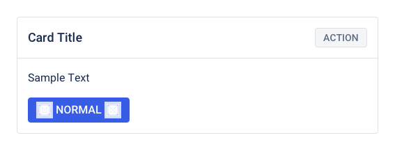
Default card
A card is made up of 2 sections, a header and a body.
The card header can have a title and actions. The title is located on the left, while the actions row is located on the right side of the card header. A small secondary button is used to display a single action, such as creating, editing, or deleting. If there are multiple actions, an action overflow menu would be used instead.
The header has limitations, but the body section can accommodate any layout of related information.
The card structure parts can be removed to prevent the part from displaying.
No padding image
No header card
The card header can be removed to prevent the card header from displaying.In some cases, using text in the body part to create Card title.
Use <Card.Body> to pad content inside a <Card>.
Alternatively, you can use this shorthand version for Cards with body only, and no other children
Design Reference
Use the correct button size.Don’t use the medium or large button on Card.Header
API
Card
import { Card } from '@ahaui/react'Copy import code for the Card component| Name | Type | Default | Description |
|---|---|---|---|
| body | boolean | false | When this prop is set, it creates a Card with a Card.Body inside passing the children directly to it |
| size | 'small' | 'medium' | 'large' | 'medium' | Card size variants |