 Algolia
Header
Introduction
Header structure is a template that explains the areas in the header and how it work which helps combine other components to create a consistent user experience.
Default
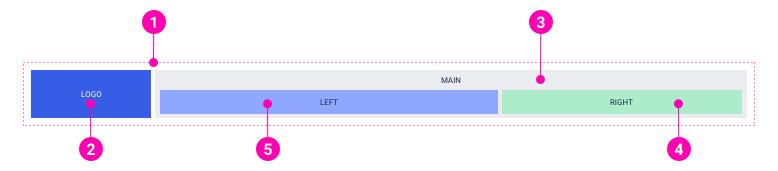
- Container: Using container to wrap header contents and grid system to set fix-width or full-width header.
- Logo: Using this area for logo of the site.
- Main content wrapper: Used to wrap all the header contents, except logo. This part is also replaced by a hamburger button on mobile.
- Right: Often used to present icons, CTA buttons or components about users' account.
- Left: Often used to display top menu of the site.
Absolute
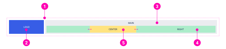
- Container: Using container to wrap header contents and grid system to set fix-width or full-width header.
- Logo: Using this area for logo of the site.
- Main content wrapper: Used to wrap all the header contents, except logo. This part is also replaced by a hamburger button on mobile.
- Right: Often used to present icons, CTA buttons or components about users' account.
- Absolute center-aligned objects: Using this area to display the components which are always center-aligned such as a countdown or session remaining component in workspace.
Examples
Desktop layout
Note: Only "LEFT" area or "CENTER" area is shown up at a time.
Mobile layout
Examples
API
Header
Header
import { Header } from '@ahaui/react'Copy import code for the Header component| Name | Type | Default | Description |
|---|---|---|---|
| show | boolean | true | Whether or not the Header is visible. |
| innerClassName | string | Custom className for Inner |
HeaderMobile.HeaderContext
HeaderMobile.HeaderContext
import { HeaderMobile } from '@ahaui/react'Copy import code for the HeaderMobile component| Name | Type | Default | Description |
|---|---|---|---|
| classNameToggle | string |
HeaderMobile
HeaderMobile
import { HeaderMobile } from '@ahaui/react'Copy import code for the HeaderMobile component| Name | Type | Default | Description |
|---|---|---|---|
| show | boolean | true | Whether or not the Header is visible. |
| hasDropContext | boolean | Define has DropContext | |
| onToggle | function | A callback fired when the HeaderMobile wishes to change visibility. Called with the requested show value, the DOM event. |