 Algolia
Message
Introduction
Using messages to communicate between system and users, to notify or to show the system's responses to user’s actions.
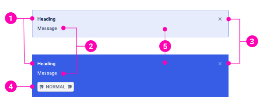
- Heading - Like a message title, using heading for message overview purpose.
- Message - The information that the system wants to send to users. Message content can include paragraphs and links.
- Close button - Optional to close the message immediately.
- CTA button - Designed for system messages only. CTA button is the main action that users can interact with a system message.
- Background - The message background attribute specifies the message variants by color changing.
Examples
Types
Form messages
Form messages are alerts that provide contextual feedback messages for user actions with input forms. It's available for any length of text, as well as an optional dismiss button.
System messages
System messages provide contextual feedback messages for typical user actions with the handful of available and flexible alert messages. It's available for any length of text, a CTA button, as well as an optional dismiss button.
Variants
Form messages
System messages
Layout
Design Reference
N/A
API
Message
import { Message } from '@ahaui/react'Copy import code for the Message component| Name | Type | Default | Description |
|---|---|---|---|
| type | 'form' | 'system' | 'form' | The Message visual type |
| variant | 'information' | 'positive' | 'warning' | 'negative' | 'information' | The Message visual variant |
| dismissible | boolean | false | Renders a properly aligned dismiss button, as well as adding extra horizontal padding to the Message. |
| show | boolean | true | controlled by: onClose, initial prop: defaultShowControls the visual state of the Message. |
| onClose | function | controls showCallback fired when message is closed. | |
| transition | elementType | <Fade> | A |