 Algolia
Overlay
Introduction
A set of components for positioning beautiful overlays, tooltips, and anything else you need.
Overlay
Overlay is the fundamental component for positioning and controlling tooltip visibility. It's a wrapper around react-popper, that adds support for transitions, and visibility toggling.
Overlay trigger
Since the above pattern is pretty common, but verbose, we've included <Overlay.Trigger> component to help with common use-cases. It even has functionality to delayed show or hides, and a few different "trigger" events you can mix and match.
Tooltips
Tooltips provide a small amount of information to an element on hover. Typically, tooltips are used to help users understand the meaning or purpose of icons, showing the full version of truncated text.
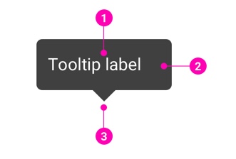
- Label - Showing the information which makes more sense for an element.
- Background - Default is transparent black background.
- Arrow - Depending on the direction of the tooltips to set a small arrow's position which can be on top, bottom, left of right.
Examples
Basic
You can pass the Overlay injected props directly to the Tooltip component.
Or pass a Tooltip component to Overlay.Trigger instead.
Tooltip placement
Short content.
Long content.
White
Delay
Basic delay.
If your want the tooltip not to disappear when you hover it, combine delay and hoverOverlay.
Design Reference
N/A
API
Overlay
import { Overlay } from '@ahaui/react'Copy import code for the Overlay component| Name | Type | Default | Description |
|---|---|---|---|
| show | boolean | false | Set the visibility of the Overlay |
| placement | PopperJS.placements | 'top' | Specify where the overlay element is positioned in relation to the target element Refer to the placement docs for more info |
| target | any | A DOM Element, Ref to an element, or function that returns either. The | |
| container | any | A DOM Element, Ref to an element, or function that returns either. The | |
| flip | boolean | true | Enables the Popper.js |
| popperConfig | object | {} | A set of popper options and props passed directly to react-popper's Popper component. |
| children required | function | A render prop that returns an element to overlay and position. See the react-popper documentation for more info. | |
| containerPadding | number | 8 | Control how much space there is between the edge of the boundary element and overlay.
A convenience shortcut to setting |
| onHide | function | A callback invoked by the overlay when it wishes to be hidden. Required if
| |
| rootClose | boolean | Specify whether the overlay should trigger | |
| rootCloseEvent | 'click' | 'mousedown' | Specify event for toggling overlay | |
| rootCloseDisabled | boolean | Specify disabled for disable RootCloseWrapper | |
| transition | elementType | A |
Overlay.Trigger
import { Overlay } from '@ahaui/react'Copy import code for the Overlay component| Name | Type | Default | Description |
|---|---|---|---|
| children required | element | ||
| trigger | 'hover' | 'click' |'focus' | Array<'hover' | 'click' |'focus'> | ['hover', 'focus'] | Specify which action or actions trigger Overlay visibility |
| delay | number | shape | A millisecond delay amount to show and hide the Overlay once triggered | |
| hoverOverlay | boolean | false | If true, also register hover events to overlay. Must use with delay.hide and hover trigger. |
| defaultShow | boolean | The initial visibility state of the Overlay. For more nuanced visibility control, consider using the Overlay component directly. | |
| overlay | function | element | An element or text to overlay next to the target. | |
| popperConfig | object | {} | A Popper.js config object passed to the the underlying popper instance. |
Tooltip
import { Tooltip } from '@ahaui/react'Copy import code for the Tooltip component| Name | Type | Default | Description |
|---|---|---|---|
| id required | string|number | An html id attribute, necessary for accessibility | |
| noArrow | boolean | false | Remove arrow |
| placement | 'auto-start' | 'auto' | 'auto-end' | 'top-start' | 'top' | 'top-end' | 'right-start' | 'right' | 'right-end' | 'bottom-end' | 'bottom' | 'bottom-start' | 'left-end' | 'left' | 'left-start' | 'right' | Sets the direction the Tooltip is positioned towards. This is generally provided by the |
| arrowProps | { ref: ReactRef, style: Object } | An Overlay injected set of props for positioning the tooltip arrow. This is generally provided by the | |
| variant | 'white' | 'black' | 'black' | The Tooltip visual variant |