 Algolia
Sidebar Menu
Introduction
Sidebar is a graphical control element that displays main navigation to the right or left side of an application window or operating system desktop to navigate away between pages.
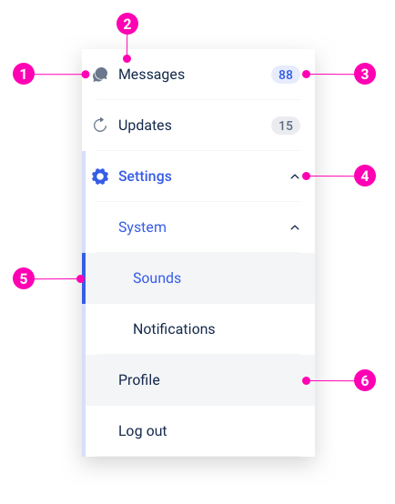
- Left icon - Used to visualize the Menu Item and provide visual context and enhance usability. Menu Items in sub-menus do not support the left icon. Left icons are optional.
- Label - Concise & descriptive title of the content within.
- Badge - An optional right-aligned badge, that contains a status or a numeric value, to indicate a running tally or a quantity-based summary.
- Toggle icon - A left-aligned icon, used to visualize the sub-menu and provide clickable action to open and close the sub-menu.
- Indicator - A left border which indicates active items.
- Background - A slight change in background color of the item when hovered or selected.
Examples
Levels
Sizes
Medium
Default size.
Small
Smaller size can be applied for both Sidebar menu levels.
States
Normal
Default state.
Active
Item background color will be changed to grey with the Indicator activated in primary color.
Disabled
Item background color will be changed to grey with the Indicator activated in primary color.
Design Reference
N/A
API
SidebarMenu
import { SidebarMenu } from '@ahaui/react'Copy import code for the SidebarMenu component| Name | Type | Default | Description |
|---|---|---|---|
| size | 'small' | 'medium' | 'medium' | Set's the size of all SidebarMenu.Item & SidebarMenu.SubMenu |
| current | string | Set current menu item | |
| onSelect | function | Callback fired when the menu item is clicked. |
SidebarMenu.Item
import { SidebarMenu } from '@ahaui/react'Copy import code for the SidebarMenu component| Name | Type | Default | Description |
|---|---|---|---|
| eventKey | string | A key that associates the SidebarMenu with it's controlling SidebarMenu.Item. | |
| disabled | boolean | false | Manually set the visual state of the SidebarMenu.Item to disabled |
| icon | string | The icon to display. The name can get from Component Icon, do not support when is children of SidebarMenu.SubMenu | |
| badge | string | function | The badge to display. The structure can get from Component Badge | |
| size | 'small' | 'medium' | Override size from context |
SidebarMenu.SubMenu
import { SidebarMenu } from '@ahaui/react'Copy import code for the SidebarMenu component| Name | Type | Default | Description |
|---|---|---|---|
| eventKey | string | A key that associates the SidebarMenu with it's controlling SidebarMenu.SubMenu. | |
| title | string | Title | |
| disabled | boolean | false | Manually set the visual state of the SidebarMenu.SubMenu to disabled |
| icon | string | The icon to display. The name can get from Component Icon | |
| badge | string | function | The badge to display. The structure can get from Component Badge | |
| size | 'small' | 'medium' | Override size from context |