 Algolia
Top Banner
Introduction
Top banner is a top section on the website, which is designed for promotional purposes.
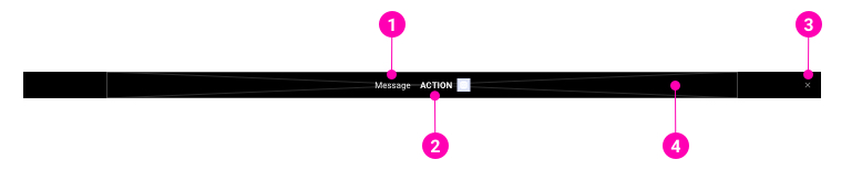
- Message - A short (normally 1 line) text content.
- Action - Resembles a button with an icon.
- Close button - A button to close the banner (optional).
- Background - An image or a color-background with the height of 48px.
Examples
Styles
Depending on the promotion themes, the top banner will be designed flexibly by color scheme which was defined in the Color library.
- The height is fixed on all platforms (desktop, tablet and mobile).
- Responsive: Using
marqueefrom right to left to the top banner content on tablet and mobile. - Image background is inside the container (12 columns).
N/A
API
TopBanner
TopBanner
import { TopBanner } from '@ahaui/react'Copy import code for the TopBanner component| Name | Type | Default | Description |
|---|---|---|---|
| bgImage | node | Sets image shape as background. | |
| dismissible | boolean | false | Renders a properly aligned dismiss button, as well as adding extra horizontal padding to the TopBanner. |
| show | boolean | true | controlled by: onClose, initial prop: defaultShowControls the visual state of the TopBanner. |
| onClose | function | Callback fired when TopBanner is closed. | |
| transition | elementType | <Fade> | A |